Tools to Create Quality Infographics that Boost Social Shares
(#ToolboxTuesday) What’s your stance on infographics – like or dislike? Four years ago, I had no idea what an infographic was or why you should consider including them in your social media marketing strategy. Infographic use is a trend that content marketers quickly followed. Fast-forward to the present and the novelty is starting to wear off. Personally, I find the majority of infographics below par, poorly constructed, too complex, and confusing. However, I’m all for mixing up blog content with an occasional high quality infographic. I actually enjoy well thought out, entertaining infographics that are comprised of accurate data and images that clarify or emphasize the written message. When we post one to our blog, much to the chagrin of my writing partner, they tend to drive quick measurable results, which we see through an increase in our social shares and blog traffic.
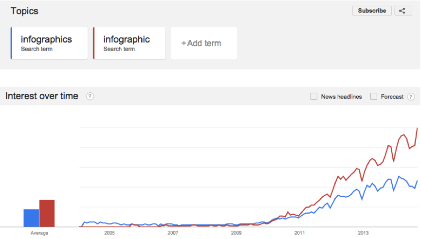
Apparently, I’m not alone in my like-dislike relationship with infographics. According to Piktochart, infographics can still bring substantial website traffic. Taking Quicksprout as an example, each infographic they did generated 41,487 visitors and 469 backlinks. Furthermore, the trends of “infographic” and “infographics” searches still indicate a significant high.
What is the value of a good infographic?
If a picture is worth a thousand words, what’s an infographic worth? When done well, they can be incredibly effective in conveying complex information in an easily digestible format.
As part of your overall social media marketing strategy, using infographics permits you to reach people unaccustomed to the technical lingo or common knowledge associated with your particular industry.
In my opinion, the best infographic is tailored to convey information or an idea in a fast, thorough and easy to understand way to a target audience. Grasshopper Marketing’s post on Infographic Best Practices, suggests that infographics do more than simply relay information. They tell a visual story. More precisely, they tell the point of the story. Infographics, when done well, have earned a growing reputation for an ability to relay information that engages a target audience.
There are many basic principals to designing infographics. The type of design should be the result of knowing your audience very well. The following three characteristics are key to infographic success:
- Quality first: You must have a strategy for your infographic. Consider the take-away. It can be a well thought out idea that serves a purpose, fills a need or answers a question from your audience. This does not negate that it can also be light-hearted and fun as, I hope, is the case with my post on Social Media Explained with Coffee.
- Data-driven: Let the data drive the topic. Most importantly, the data must be reliable and valid. Due diligence is vital to ensure your infographic has staying power.
- Good design: Keep the design relatively simple and clean. Be creative and original. Infographics are supposed to stand out, not look like everything else. The more original the design, the greater platform your data has to speak to its audience.
How to create simple but good infographics on a budget
Back to my original question. Are you on the infographic bandwagon or not? If you are, Kissmetrics 19 Warning Signs Your Infographic Stinks is a must read. Assuming you have a fantastic original idea for your infographic, how do you make it look good and stand out, especially, on a budget?
My design skills are limited and designing infographics from scratch is certainly outside of my pay scale. Fortunately, there are plenty of tools available online which can help you make good infographics without too much hassle. The best part is you don’t need to spend a penny or hire a design expert. These tools are user-friendly and, anyone following the design principals noted above can easily build a visually appealing infographic.
Here are three online tools that are quite useful for quickly creating simple but good infographics:
- http://infogr.am/– Tagline: Infographics. The Easy Way. Free sign up, good for creating word clouds and bold charts. Infographics and charts are quick to use, fast to share, and easy on the eye.
- http://www.easel.ly/– Mission: To allow users to create and share visual ideas online, easel.ly, is surprisingly powerful. Features thousands of free infographic templates and design objects, which users can customize to create and share their visual ideas online.
- http://piktochart.com/– Tagline: Making information beautiful has never been easier. Although, free for casual users, you have to pay to unlock all the options. With just a few clicks, users can convert tedious data into a beautiful infographic. It has features which enable a non-designer to design in a professional way.
Surprisingly or, maybe, not, I find myself unable to end this post without an infographic. If you want to read and see more on why infographics are still relevant in your social media marketing strategy, check out the infographic below from Piktochart that summarizes the compelling reasons why:

Do you have any advice on infographics best practices or any tools to share? We would love to hear from you.


